Contribution Guide
When contributing to onyx, please respect the Schwarz IT Code of Conduct and our technical vision/guidelines.
Target audience
This document is directed at people that are developing for onyx. It gives tips and guidelines on what should or must be considered when working with onyx.
Prerequisites / Technical setup
Install Node.js version 22.
We recommend using fnm for managing your node versions which will automatically use the correct node version when working in the onyx repo.Install the pnpm package manager with a compatible version to
^9.12.3
Recommended IDE Setup
We follow the official Vue recommendation for IDE setup which is VSCode with the Vue - Official extension.
Set up the monorepo
In order to work in the onyx monorepo, you need to install the dependencies by running:
pnpm installPackage scripts
Depending on which package you want to contribute, there are different scripts available. A full list can be found in the package.json file of the corresponding package. Here is a list of the most commonly used scripts.
pnpm install # install all dependencies
pnpm lint:fix:all # lint and fix all packages
pnpm format:all # format all filespnpm dev # run Storybook in dev mode when developing components
pnpm build # build all onyx components
pnpm test # run unit tests
pnpm test:components # run Playwright component testspnpm dev # run docs in dev modeCreating a Pull Request
Pull Requests are very welcome! Please consider our technical guidelines when contributing to onyx.
- Create a fork to commit and push your changes to
- When your changes affect the user and need to be released, add a changeset.
- Then create a PR to merge your changes back into our repository.
When your PR gets approved, you can expect a pre-release immediately after it is merged. Production releases are planned to be published every 2 weeks after the release of version 1.0.0.
Screenshot tests
Component screenshot tests using Playwright will only be performed in our GitHub workflows to ensure consistency of the resulting images which vary on different operating systems.
If you made visual changes to components, you can use this Workflow to update the screenshots on your branch.
Developing Components
Below is the basic code for a new onyx component. For more information about the density feature of onyx, visit our density docs.
<script lang="ts" setup>
import type { OnyxMyComponentProps } from "./types";
import { useDensity } from "../../composables/density";

const props = defineProps<OnyxMyComponentProps>();

const { densityClass } = useDensity(props);
</script>

<template>
  <div :class="['onyx-my-component', densityClass]">
    <!-- component HTML -->
  </div>
</template>

<style lang="scss">
@use "../../styles/mixins/layers.scss";

.onyx-my-component {
  @include layers.component() {
    // component styles...
  }
}
</style>import type { DensityProp } from "../../styles/density";
export type OnyxMyComponentProps = DensityProp & {
// component props...
};Include CSS Layers
As you can see in the code snippet above, we make use of Cascade Layers to simplify how different style sources cascade. By putting all our styles into layers they can also be easily overwritten by users.
Therefore, you must make use of the @include layers.component() mixin as shown above. This will also normalize styles for this class and it's children. The scoped rules will be applied in the onyx.component layer.
Custom density styles
For most cases, the CSS variables for densities will already support that the component adjusts based on the current density. In exceptional cases it might be required to apply special styles for the densities which can not be covered with this.
You can use our density mixin in this case:
<style lang="scss">
@use "../../styles/mixins/density.scss";

.onyx-my-component {
  @include density.compact {
    --onyx-my-component-padding: var(--onyx-spacing-sm);
  }

  @include density.default {
    --onyx-my-component-padding: var(--onyx-spacing-md);
  }

  @include density.cozy {
    --onyx-my-component-padding: var(--onyx-spacing-lg);
  }

  @include layers.component() {
    padding: var(--onyx-my-component-padding);
  }
}
</style>
Testing
We require every component to be thoroughly tested. This project uses Playwright and Vitest for testing.
Component (UI) tests
Generally playwright component tests (kept in .ct.tsx-files) suffice to test a component.
Component tests must include screenshot tests to ensure that any style changes happen intentionally and can be approved by our UX. To easily generate and test screenshots for all main component states the executeMatrixScreenshotTest (in file /packages/sit-onyx/src/playwright/screenshots.tsx) utility is to be used.
In our monorepo playwright/component tests are run non-interactively using the pnpm test:components script.
To use Playwright interactively run pnpm dlx playwright test --ui (add the --headed flag to open the test browsers) in the package directory.
CI
To investigate failing playwright tests from the CI locally:
- Download the
html-report--attempt-xartifact after the pipeline has finished. - Unzip the archive
cdinto the package you want to see the report for- Run
pnpm dlx playwright show-report
VSCode
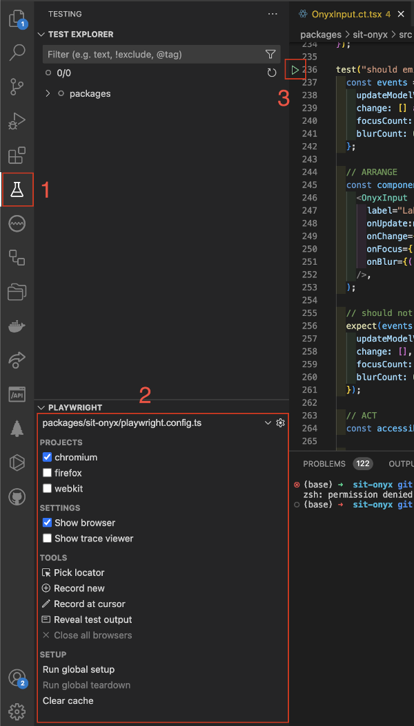
We recommend the Playwright Test for VSCode extension for running component tests in development. It allows to build and run specific tests interactively out of the IDE (see annotation 3 in screenshot beneath). If you encounter any issues please make sure
- to run the
pnpm buildscript at least once for the pacakge - to only select the playwright config file for the current package your are testing
- to run
Run global teardown,Close All BrowsersandClear Cache
You find the playwright VSCode extension settings (see annotation 2 in screenshot beneath) in the Testing section of VSCode (annotation 1).

Unit tests
For self-contained logic, excluding Vue components, unit tests (kept in .spec.ts-files) can be written using Vitest.
In our monorepo unit tests are run using the pnpm test script.
