Breakpoints and grid
Column grids in ui design and development establish a structured layout, organizing content, components and elements cohesively. They provide a framework for alignment and distribution, ensuring consistency and hierarchy. Additionally, grids serve as the foundation for smooth responsive behavior, allowing seamless adoption to different screen sizes and resolutions, ultimately enhancing usability and overall user experience.
To see the grid and breakpoints in action, feel free to have a look on the grid playground.
Understanding the grid
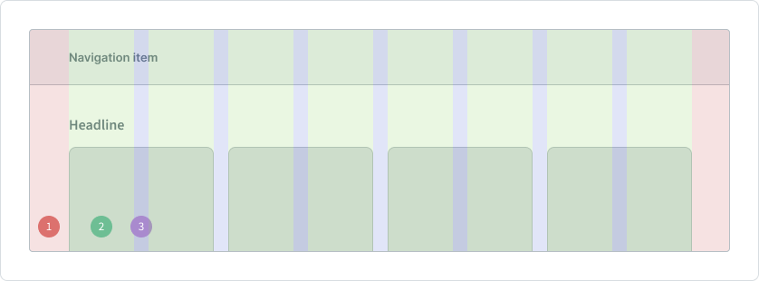
To understand the anatomy of a column grid, it is essential to comprehend its key components: margins, columns and gutters, which function harmoniously together. Visual examples and further details can be found below.

1 Margins
Margins delineate the outer boundaries of the grid, providing spacing between the content and the edges of the interface. The margin has always a fixed value, that adopts to the breakpoint of the screen.
2 Columns
Columns define the vertical divisions within the grid, organizing content into distinct sections. The value of the column unit is always flexible, what guarantees fluent sizing behavior of the content elements.
3 Gutter
Gutters are the space between columns, ensuring adequate separation and consistent spacing between objects. The width of the gutter has always a fix value, that is defined by the breakpoint.
Columns
One of the key characteristics of columns is their flexibility in width, allowing them to adapt dynamically to the size of the screen. However, on smaller screens a condensed layout is achieved by utilizing fewer columns, where on the other side wider screens like desktop monitors increase the number of columns to make the most of the available space. This adaptive approach ensures a continuously and consistent width of elements across different screen sizes. Moreover, as the number of columns increases on larger screens, additional virtual space is effectively gained. This expanded canvas provides designers and developers with more room to showcase content.
To maintain user's happiness with ultra-wide screens, such as 2k and above, consider a maximum width restriction on the grid, which obviously effects the content, as well.
Attention
These limits can be set to 1440px or 1920px, striking a balance between expansive screen usage and optimal content presentation.
While these grid boundaries are optional, it is highly recommended to do so to guarantee readability.
The determination of the optimal number of columns is closely tied to the concept of the breakpoints, which define the points at which the layout of the ui responds to changes in screen size. The onyx design and dev team responsible for the fundamental guidelines established those breakpoints and grid implementations.
Breakpoints
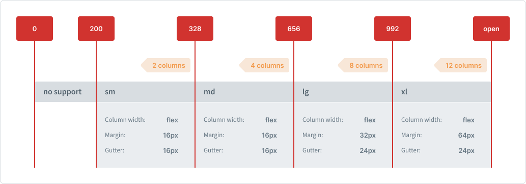
With the onyx design approach, we recognize the significance of tailoring the layout to different screen sizes through the implementation of specific breakpoints. Each breakpoint corresponds to a distinct grid system, carefully crafted to accommodate the diverse needs of onyx applications. From small mobile screens to expansive desktop displays, onyx offers a range of specifications and adjustments for the column grid, ensuring seamless adaption across various devices and screen resolution.
For the technical implementation, please see the developer documentation.

2xs breakpoint
The smallest breakpoint starts at 320px and ends at 576px screen size. It is mostly used with smartphone screens.
| Unit | Value |
|---|---|
| Margin | 16px |
| Column quantity | 4 |
| Column width | flex |
| Gutter | 16px |
xs breakpoint
This breakpoint starts at 577px and ends at 768px screen size. It is mostly used with portrait framed tablet screens.
| Unit | Value |
|---|---|
| Margin | 16px |
| Column quantity | 8 |
| Column width | flex |
| Gutter | 16px |
sm breakpoint
This breakpoint starts at 769px and ends at 992px screen size. It is mostly used with landscape framed tablet screens.
| Unit | Value |
|---|---|
| Margin | 32px |
| Column quantity | 8 |
| Column width | flex |
| Gutter | 24px |
md breakpoint
This breakpoint starts at 993px and ends at 1440px screen size. It is mostly used with smaller desktop screens.
| Unit | Value |
|---|---|
| Margin | 64px |
| Column quantity | 12 |
| Column width | flex |
| Gutter | 24px |
lg breakpoint
This breakpoint starts at 1441 and ends at 1920px screen size. It is mostly used with larger desktop screens.
| Unit | Value |
|---|---|
| Margin | 64px |
| Column quantity | 12 or 16 |
| Column width | flex |
| Gutter | 32px |
Maximum content width can manually be set to the md breakpoint width.
Details can be found here.
xl breakpoint
This breakpoint starts at 1921px and has no maximum limit. It is mostly used with very large desktop screens.
| Unit | Value |
|---|---|
| Margin | 64px |
| Column quantity | 12, 16 or 20 |
| Column width | flex |
| Gutter | 32px |
Maximum content width can manually be set to the md and lg breakpoint width.
Details can be found here.
Attention
By default, all grids are left aligned to the edge of the screen. For having more flexibility, the grid can be center aligned, as well. Keep in mind that this is not the default setting. Please use the individual alignment carefully, because it highly depends on the type of the application and the content it has to display. If you are not sure, stick with the default setting or talk to the ux designer, that is assigned to your project.
Sidebar grid
Overall, the grid and breakpoints for the sidebar operate the same way like those employed for the whole screen, in terms of logic. Similar to the whole-screen-grid- the sidebar incorporates margins, columns, and gutters, that dynamically adapt to its width. However, the values used for the sidebar grid and breakpoints are varying. For detailed specifications, refer to the definitions provided below.

sm breakpoint
This is the default side of the sidebar.
| Unit | Value |
|---|---|
| Margin | 16px |
| Column quantity | 2 |
| Column width | flex |
| Gutter | 16px |
md breakpoint
| Unit | Value |
|---|---|
| Margin | 16px |
| Column quantity | 4 |
| Column width | flex |
| Gutter | 16px |
lg breakpoint
| Unit | Value |
|---|---|
| Margin | 32px |
| Column quantity | 8 |
| Column width | flex |
| Gutter | 24px |
xl breakpoint
| Unit | Value |
|---|---|
| Margin | 64px |
| Column quantity | 12 |
| Column width | flex |
| Gutter | 24px |
Screen resolutions
Pixel density
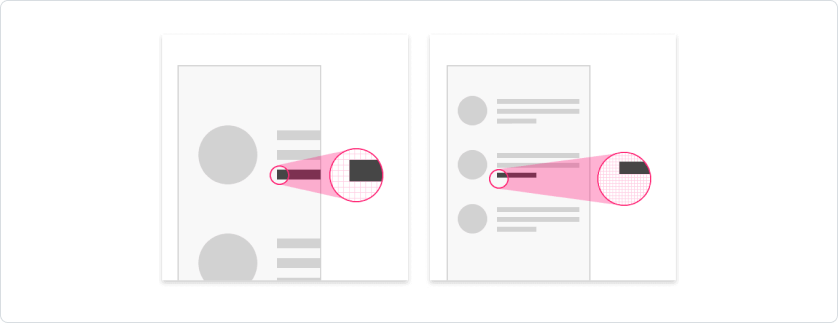
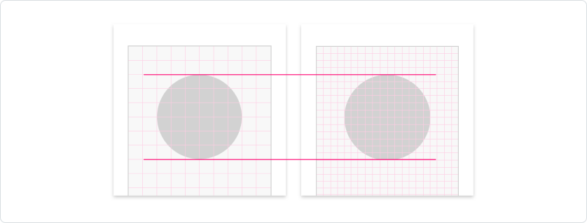
Pixel density refers to the concentration of pixels within an inch, dictating the level of detail and clarity in digital displays. Higher pixel density results in sharper images and text. For instance, an image sized at 100x100 pixels appears larger on devices with lower pixel density compared to those with higher density. Modern smartphone displays boast exceptionally high resolutions, rendering individual pixels virtually indistinguishable to the naked eye. In fact, the pixel count on a 5-inch smartphone screen can rival that of a standard 27-inch monitor. However, directly adopting dimensions and font sizes from traditional PC monitors would render elements and text too small for comfortable viewing. To address this, content is automatically scaled on high-resolution screens to ensure optimal readability and usability.

Scaling factor
Modern mobile devices employ scaling techniques to maintain consistency in displaying UI elements across various screen resolutions. High-resolution displays often use multiple physical pixels to represent a single illustrated pixel. To ensure uniformity, a logical unit is established, independent of the device's actual pixels, and appears consistent on all displays through scaling. While the specific definition of these logical units varies between iOS and Android, the fundamental principle remains consistent. The scaling factor employed is determined by the pixel density of the device, ensuring an optimal user experience across different mobile platforms.

Attention
The scaling factor enables the design of content at a logical resolution, irrespective of the device's actual resolution. In these foundational guidelines here, all dimensions and distances are specified based on this logical resolution rather than the physical resolution of the device. The device itself handles the scaling process to match the available pixels, ensuring consistent display across various devices.
Work in progress
This documentation is still in progress.
