Colors
Colors play a crucial role in an user interface for enhancing the visual appeal and user experience. They go beyond just aesthetics, serving as powerful tools to convey information, establish hierarchy, and evoke emotions. The usage of a well-thought-out color scheme can guide users, highlight important elements and create a cohesive and memorable design. The choice of colors significantly influences how users perceive and interact with the interface, making it an integral aspect of an effective design.
Understanding light & dark mode
The onyx color scheme is tightly connect to the design variable systematic, that applies the values to the interface. Therefore, please get familiar with the logic of variable levels used in onyx. This will be the foundation of understanding how colors will be interpreted for light and dark mode.
To learn more about how to configure the light & dark mode in your application, refer to the technical documentation.
Global color scheme
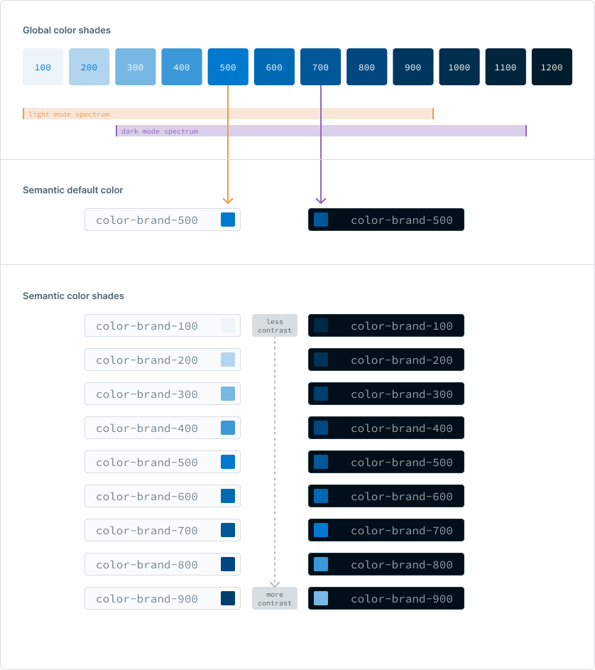
In order to establish a versatile foundation that offers both, a light and dark mode, onyx colors are based on a comprehensive global color palette designed to work as a universally adaptable scheme. This palette spans from the lightest luminosity to the deepest darkness, covering a broad spectrum. However, it's important to note that the extremes at both ends of the palette are not suitable for all modes. Specifically, the delineation is set by values of 100 and 1200, demarcating the boundaries for usability in different modes. It's also important to know that this nuanced palette of global shades is intentionally excluded from the design and development process of creating an onyx user interface.
Semantic color scheme
The color values within the global color scheme have been precisely translated into the semantic context of light and dark mode. This refinement involves condensing the scale to a series of 9 values in increments of 100, with the pivotal point of 500 serving as the default reference for both light and dark modes. Notably, the semantic color schemes for the light mode now referres to a distinct spectrum when compared to their dark mode counterparts.
Semantic colors are defined in relation to the background, dynamically adjusting luminance to harmonize with the unique characteristics of each mode. This intentional differentiation ensures that the visual aesthetics of the interface remain optimal in both light and dark settings.
Example

Themes
Beyond the different shades, the hues in a color scheme also significantly impact the overall appearance. onyx offers two main types of color palettes: "themed color palettes" and "universal color palettes". Themed colors set the brand's tone in the UI, defining its unique look. Universal colors, on the other hand, support system information and are used across all themes to complete the brand's color range. This thoughtful approach ensures a good balance between expressing the brand's style and maintaining clarity and functionality for users.
Themed color palette
Universal color palette
To have access to the color variable set for your implementation, please visit the variable documentation.
Roles of themed colors
Themed colors reflect the brand's identity, adapting their main colors. While primary colors vary between the themes, the usage of them is constant.
Primary colors highlight call-to-action elements and direct the focus of the user to the most important interactions. Brand-neutrals are used in the background and secondary actions, providing a subtle backdrop that allows primary colors to shine.
Page background
The background color of the whole page is always set to onyx-color-base-background-tinted, which referrs to the brand-neutral palette, to be a very subtle color.
Component background
The default background color of components is always onyx-color-base-background-blank to be white in light mode und very dark in dark mode.
Call-to-actions
Call-to-actions are always used with the onyx-color-base-primary-500 value.
Roles of universal colors
Universal colors serve a specific role independent from the chosen theme. This is the hierarchical logic behind it:
Danger
The danger color is used for urgent situations that need immediate attention. It's specifically for critical notifications or interactions linked to deletions and should be used carefully to convey seriousness.
Warning
The warning color communicates medium-urgent situations and is less important than the danger color. It's suitable for scenarios like security questions where caution is needed.
Success
The success color shows positive outcomes or successful task completion, giving a sense of achievement. It's used when announcing successful operations or good news.
Info
The info color is for sharing non-emotional information and is the least important among universal colors. It's used when giving straightforward information without any emotional tone.
Quantitatives
Quantitative colors help makeing infographics look good. They're used to distinguish between different parts in graphs, charts, or other visuals, making it easier to understand quantitative information.
Ratio
The recommendation for working with colors is described with the 60-30-10 guideline, aiming to achieve a harmonious visual composition. This principle suggests allocating 60% of the interface being blank, serving as a cohesive backdrop.
30% of colors should be used as supportive elements, complementing the blank hue, with the usage of brand-neutal colors.
The remaining 10% are dedicated to an accent color, strategically applied to highlight the key elements and call-to-actions. This in fact, is always the brand-primary color in the onyx design system.
Contrast
To ensure a good contrast, orient yourself on the following principles.
Balance brightness
Ensure a clear distinction between foreground and background colors by balancing their brightness. A well considered contrast through brightness enhances legibility and visual harmony.
Text color ratio
Adhere to the onyx accessibility standards, aiming for sufficient contrast ratios between text and background colors. This ensures readability for users with different visual abilities.
Hierarchy through intensity
Establish hierarchy by varying color intensity, using the color shade palette.
