Typography
The onyx font system includes two different font families that can be used throughout your application, pending on the usecase. It contains several headline styles as well as paragraph styles and mono space styles.
INFO
The font families that can be used with onyx are:
Lidl and Kaufland font families are coming soon.
Brand typography
The default font family is defined to be the Source Sans and Source Code Pro (monospace). If you are creating a new onyx project in Figma, this will always be included out-of-the-box. In the initial phase, Source Sans applies to all color themes that are provided by onyx.
If you want to use font families in development, please take a look at the technical documentation.
Headlines
The onyx design system offers four types of headlines. H1 is reserved for the main title of the page because it establishes primary focus and captures the user’s attention. The h2 style is used for describing sections in the interface. Its main goal is to cluster different types of content into groups and labelling them. Single elements, on the other hand, are described by the h3 style. The least impact, and therefore the lowest hierarchy, has the h4. It is used for structuring information inside a single component. Table column headlines is a good example at this point.
For the technical implementation of the headlines, please see the technical documentation.
WARNING
Note that h5 and h6 headlines are not part of the onyx font system and should not be used therefore. Because they can occur on technical side for semantic reasons, they are styled the same as h4.
onyx design system
onyx design system
onyx design system
onyx design system
onyx design system
onyx design system
Paragraphs
Paragraph texts are used for all kinds of information, explanations, narratives and continuous text in general. The default size is used as standard throughout all applications. The small-sized paragraph style is used for labels and is therefore in a lower hierarchical order. The largest paragraph style is used for very strong and eye-catchy information, because it has the biggest visual impact.
For the technical implementation of the paragraphs, please see the technical documentation.
onyx design system
onyx design system
onyx design system
Links
Links are the tool of choice to refer to another page. By default, links have an underline and are primary-colored. Under consideration of the text styling principles, the text color can be changed in exceptional usecases. Please double check with your assigned UX-Designer.
For the technical implementation of the links, please see the technical documentation.
Usage
It is important to keep the usage of font styles consistent throughout the whole application. Only by following this principle, a clean and hierarchical UI structure can be guaranteed. You should focus on the correct usage for headlines in particular! If you have questions about it, please contact your assigned UX-Designer.
Line length
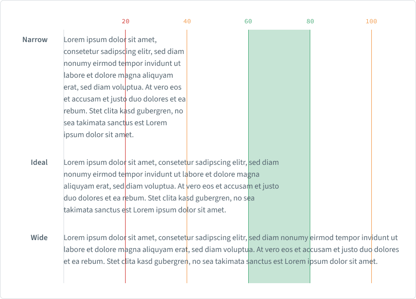
To create a flowing readability, the line length is key. There are no strict rules on the usage, due to the dependency on screen size, breakpoint and column grid. Nevertheless onyx provides some guidelines and recommendations for your implementation.

Generally speaking: the wider the line the harder to read and to follow. The optimal range for readability is usually between 60 and 80 characters. If the text is way longer than this guideline, just use a second text column instead.
Writing style
If you want to use text in your application, please take the following principles into account.
Focus
Formulate your text purposefully and concisely. Do not use unnecessary verbiage. Nevertheless, form short, complete and grammatically correct sentences.
Descriptive
Describe prompts clearly and use the imperative (especially with buttons). Buttons are always titled with verbs and should at best consist of only one word. More than one word is possible in exceptional cases.
Hierarchy
Hierarchy is key to a well working user experience. Always be aware on how to use section titles and element headlines. Also use color and contrast for creating hierarchy in a subtle way.
Context
Texts must always have a connection to the things that are going on in the screen, in terms of content. Never text about content, the user cannot relate to.
Consistency
Texts should never be built in uppercase. Always use the provided line height for spacing. Do not try to squeeze characters or text blocks. Less is more - Minimalism is key.
Truncation
For more details about truncation and how to use it, please visit the truncation basics.
