Layout
Different layouts are the best way to focus the users attention and create hierarchy. Additionally, a well chosen layout serves as a guiding hand for the user to work with the application. Our recommended way to create both an attractive and accessible layout is to follow the principles below.
Responsive
Layouts should be adaptive in their structure displayed on multiple devices and screensizes.
Clean
Using a column grid for creating interfaces with onyx is not only mandatory but also the best way to build pixel perfect and adaptive layouts.
Content related
Whether implementing a sidebar for horizontal content structure or building a vertical only scrollable page, the layout always has to match the content - not the other way around. First think about how to structure the content and put it in a fitting layout afterwards.
Anatomy
This section defines the anatomy of the whole page layout. If you want to learn more about the anatomy of single components in particular, please visit the component documentation.
In a maximum expression, a typical page layout consists of these regions.
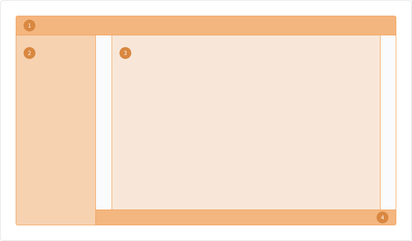
1. Main Navigation
Primary navigation to jump between major pages inside the application. In addition, global interactions can be placed here. This section always sticks to the top (alternatively to the left side) and is independent from scrolling.
2. Side Navigation
Secondary navigation to jump between pages that are part of the master-detail-structure. In order to be a flexible object, secondary interactions and information can also be placed here. This section always sticks to the side of the screen and is independent from scrolling.
3. Page content
The main content is displayed here. This is totally flexible in its representation and depends on the used grid and components. This section is the main scroll container of the interface.
4. Confirmation
Global confirmations are triggered by a global section at the bottom of the screen. It is independent from scrolling and sticks to the bottom. This section can also be applied to objects.
This is just an example layout for showing the possibilities of having several sections. It is important to be aligned with the column grid, that is provided by onyx. For more information about the components for main navigation, side navigation and confirmation, please visit the component documentation.
Alignment
Page layout
Column grids for the whole page layout are always left aligned by default.
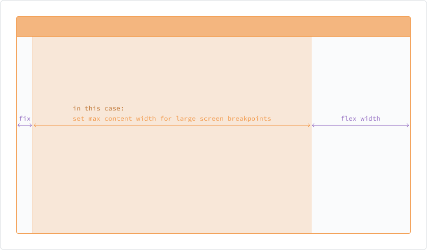
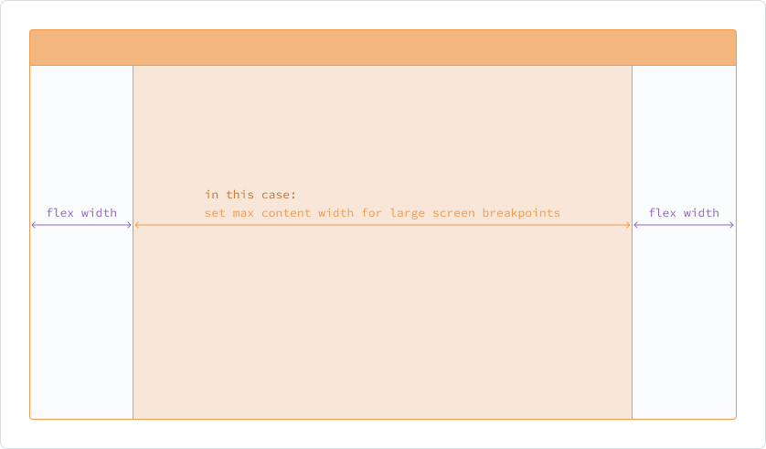
A center aligned version is possible alternatively. The choice of alignment doesn't follow strict rules. But please consider the balance of the target screen size, the target user group, the target use-case and the content you are building/designing for.
Component layout
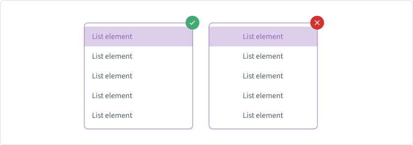
The local structure of components is always left aligned. The only exception here are the center aligned and right aligned options for table columns.
Structure of content
Vertical structure
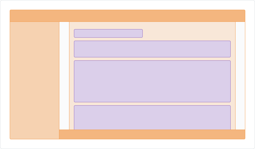
For structuring the content of the page, a vertical layout, that can scroll down, is the easiest way by default.
Horizontal structure
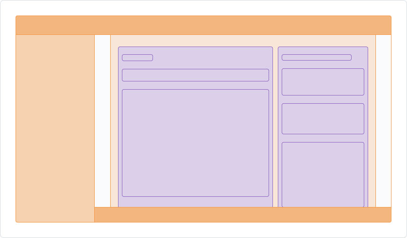
Another alternative is the horizontal layout. By having two sections of content next to each other horizontally, the user gets a better side by side comparison/interactivity between the content groups. This could be a big advantage for some usecases. Nevertheless, you are limited by available space due to screen size restrictions, what marks the big disadvantage on the other side. So please assess your content and your use case carefully to find the right layout for your application.
Visual rhythm
In every designated section of the layout, it is crucial to organize components and internal elements under a manner that maintains visual and functional connections among elements, regardless of the size of the screen.
To guarantee an smooth overall appearance, it is key to keep the proportions of content section in balance.
To establish a sense of structure in a layout, the initial phase involves visually grouping objects. Elements within a layout that share similar content or functionality can be clustered together and distinguished from other elements through the use of open space, typography and dividers for example.
