Truncation
The decision to use line break or truncation depends on various factors, including the type of content, available space and the desired user experience. Due to flexibility, onyx provides both properties to ensure the best solution for each usecase.
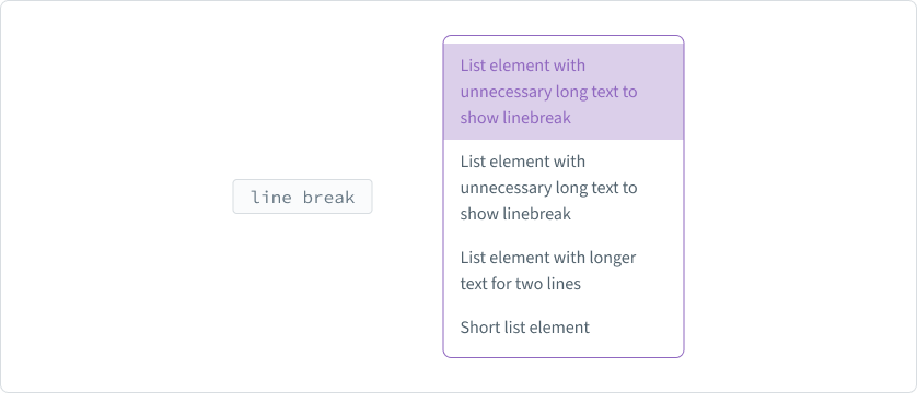
Line break
Use line breaks when maintaining the readability and flow of the text is crucial. Breaking content into multiple lines can make it easier for users to scan and comprehend.

Line breaks are suitable when the nature of the content benefits from a more extended and continuous presentation. They can help leverage whitespace effectively, creating a visually balanced layout. This is particularly useful for interfaces, where a more open and spacious design is preferred.
Truncation
Truncation is essential when there is limited space, such as cards or narrow columns. It allows to present concise information without sacrificing the overall layout.

Truncation is effective in preventing clutter, especially when dealing with long titles, headlines or labels. When using truncation, please ensure that the element is still readable and understandable. If not, please have a look at the abbreviations section.
In responsive usecases, truncation can be employed to adopt content to varying screen sizes.
Abbreviations
Abbreviations can be powerful tools in designing and building an interface for conveying information succinctly. However, their effective use requires careful consideration to ensure clarity and a positive user experience. Here are some key points to focus on:
Clarity is key
Prioritize clarity over brevity. Users should easily understand abbreviations without confusion. Use widely recognized abbreviations or provide clear explanations.
Consistent usage
Maintain consistency in how abbreviations are used throughout the whole application. Inconsistent usage disrupts the overall coherence of the interface.
Avoid overuse
Avoid densely clustering abbreviations in a single space. Overuse can overwhelm users visually. Prioritize for the most important and common abbreviations.
Tooltips
Whenever possible, implement tooltips on hover to provide users with expanded details about abbreviations. This extra layer of information ensures users are not left guessing.
